A tool to visualize relative risk before investing
Jun 21, 2026
This is The Debrief - a post-game analysis for LPs. Breaking down the plan, the reality, the result, and key takeaways of real deals to better understand risk and invest accordingly.
The Debrief is dedicated to learning how to assess risk. Syndicated real estate investments are data-heavy and complex. Accurately and comprehensively assessing risk in a deal takes time and skill.
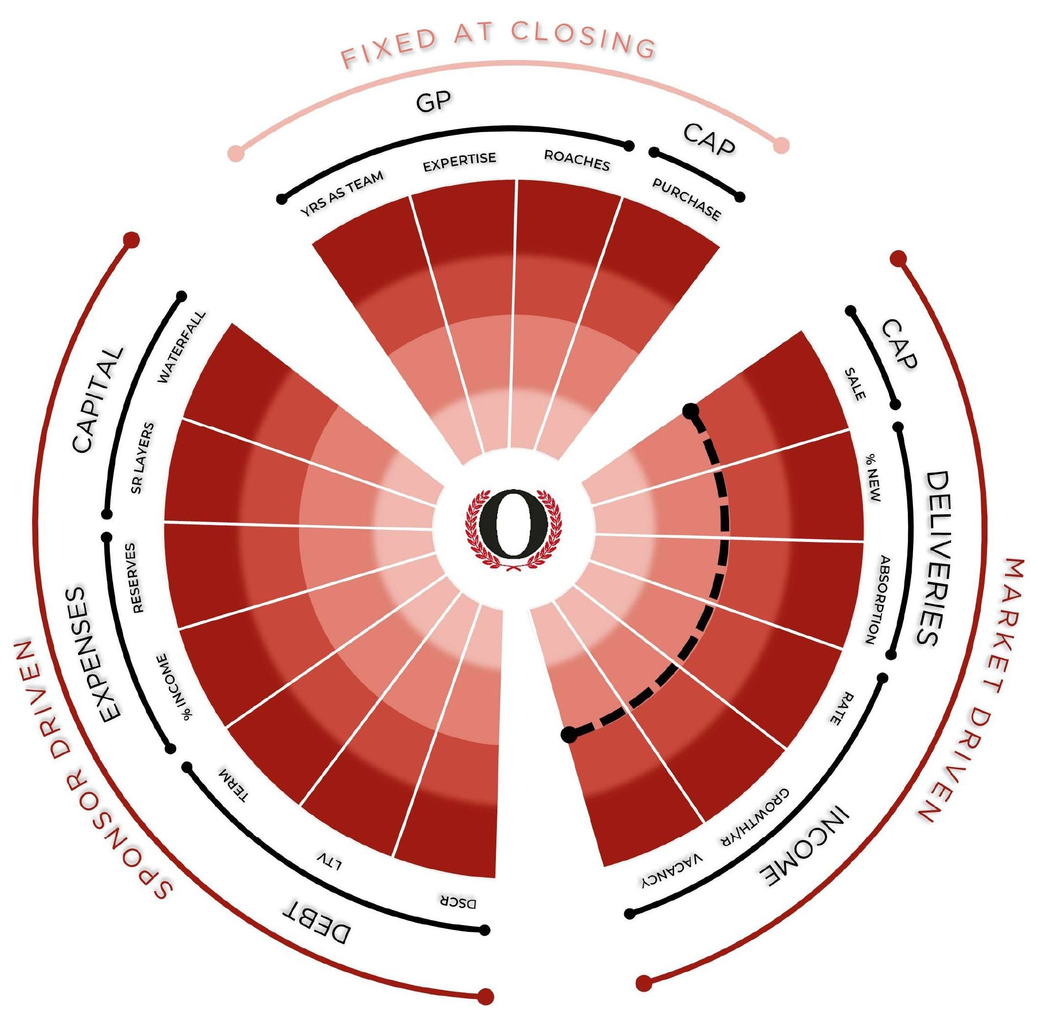
In order to more easily visualize risk, I have created the Risk Radar.
Thanks for reading Net Zero is a Win! Subscribe for free to receive new posts and support my work.
After reviewing dozens of exited deals, patterns of success and failure emerge. When viewed through the lens of market cycles, it becomes clear that although there are infinite ways to structure and execute a deal, the breaking points are finite and can be seen as a risk before the breakage occurs.
Risk Radar is an educational framework, not investment advice. This is a visual aid for comparing a deal’s assumptions to historical norms - a prompt for your own analysis, not a rating, a recommendation, or a prediction of any outcome.1
How it Works
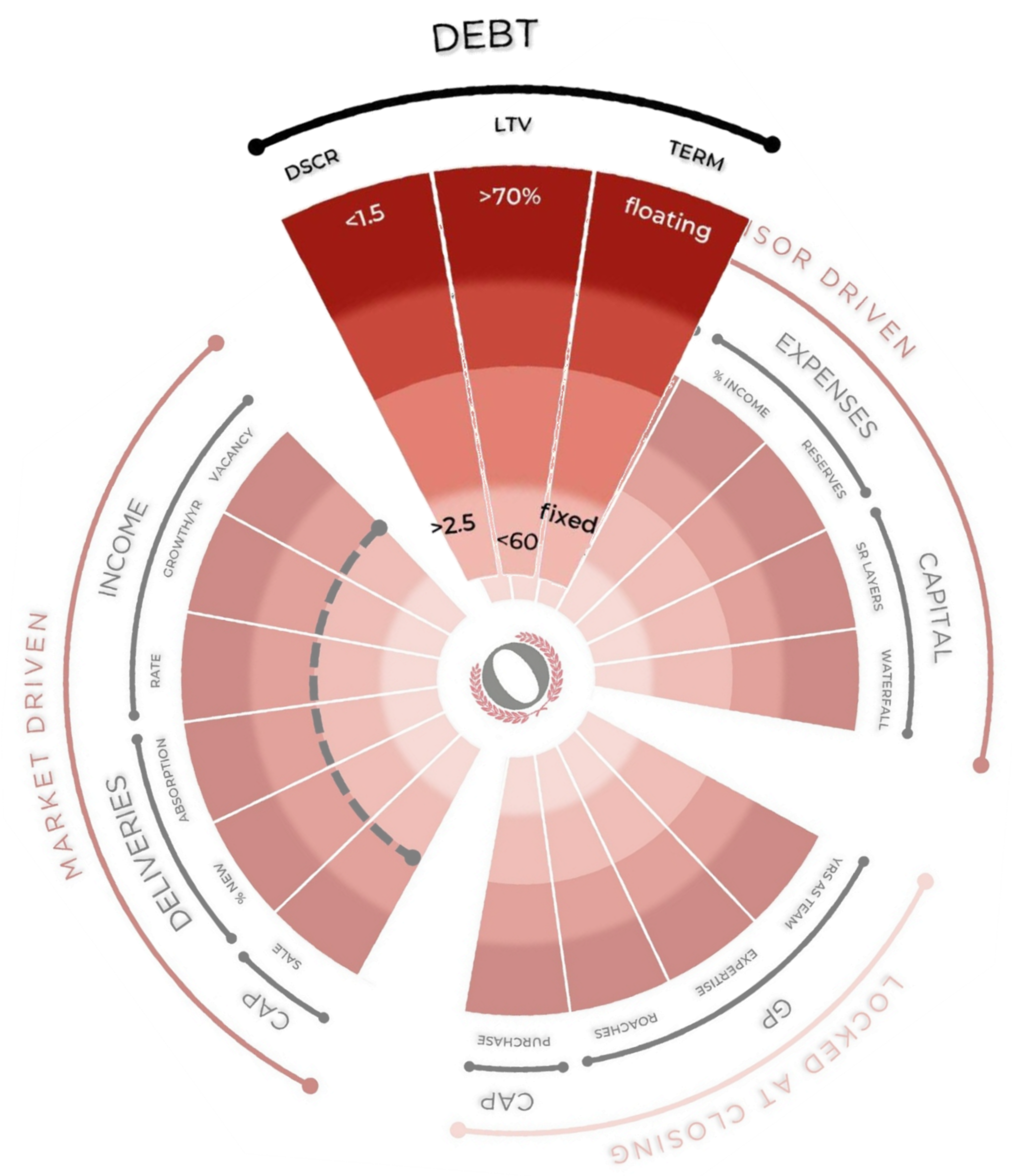
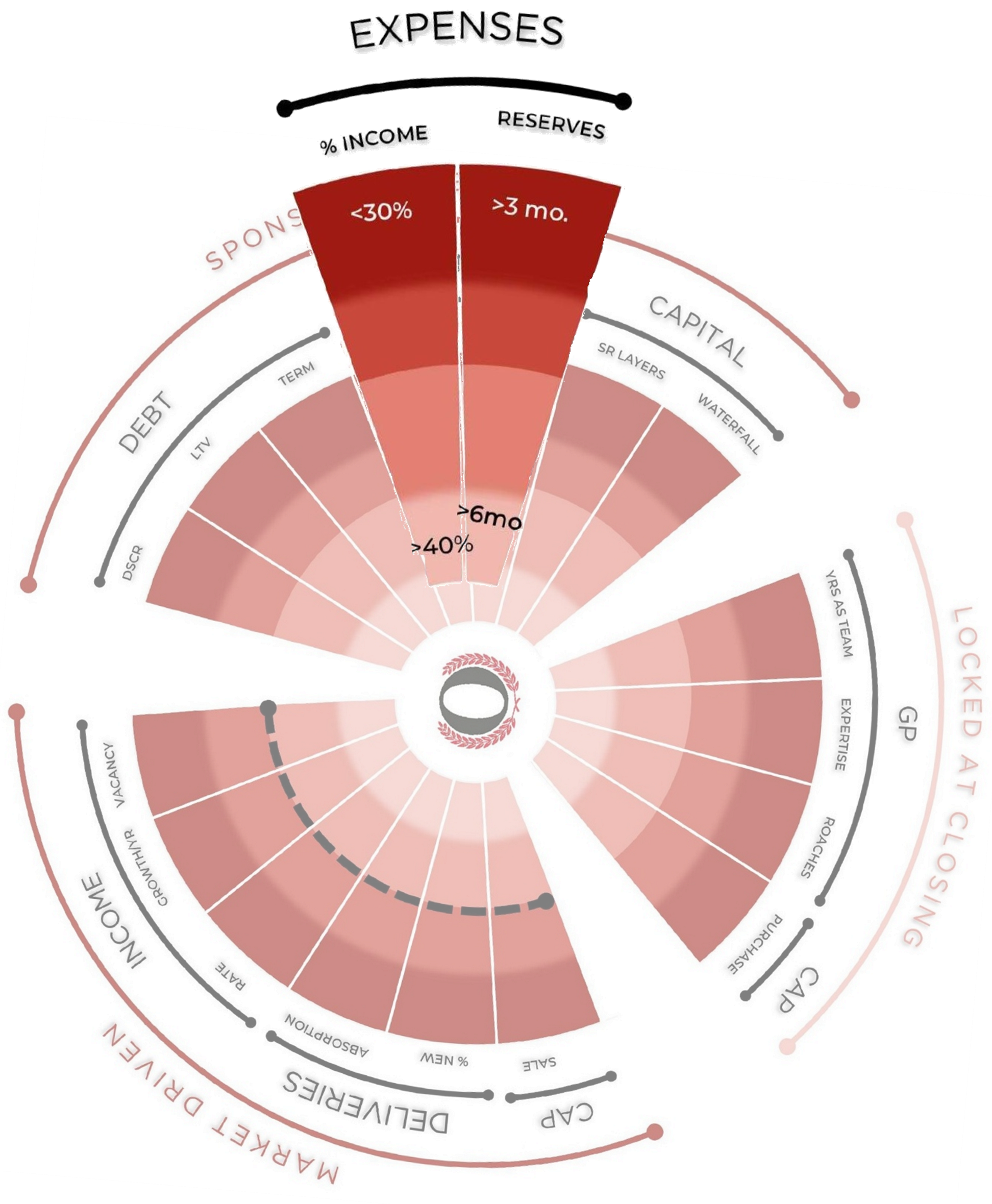
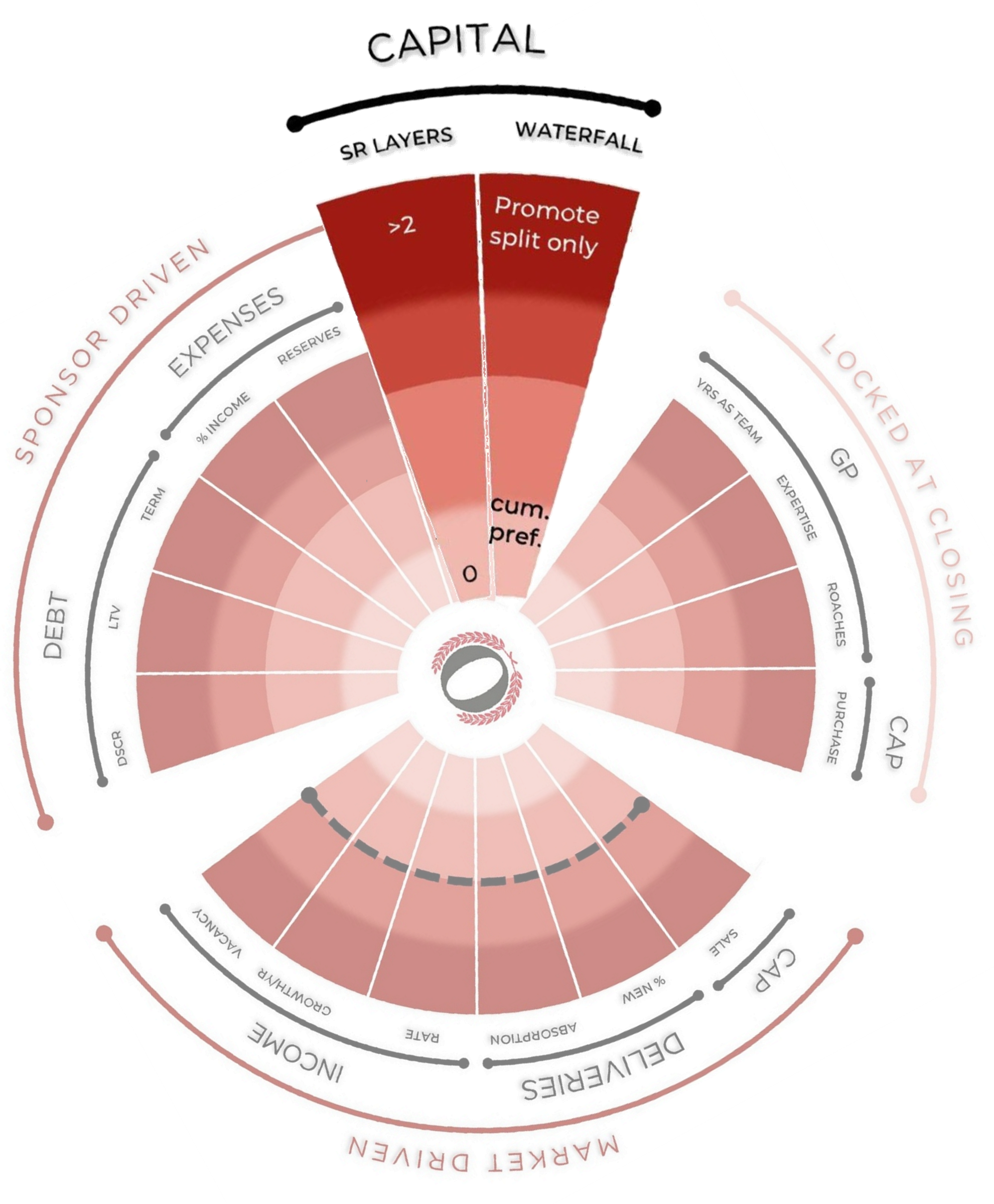
I have identified 17 potential breaking points and plotted each as a spoke on the “radar” against historical market metrics and industry norms. The outer ring represents the less favorable/higher risk position for a deal. The innermost ring represents the more favorable/lower risk position. Note that risk is relative: low versus high. There is no risk-free position. Any one of the spokes has the potential to single-handedly lead to a total loss.
Let’s look at each spoke in detail to understand how the Risk Radar works. For the sake of brevity, I am assuming the definition of each spoke is known. Discussion here is focused on risk positioning and use of the Risk Radar.
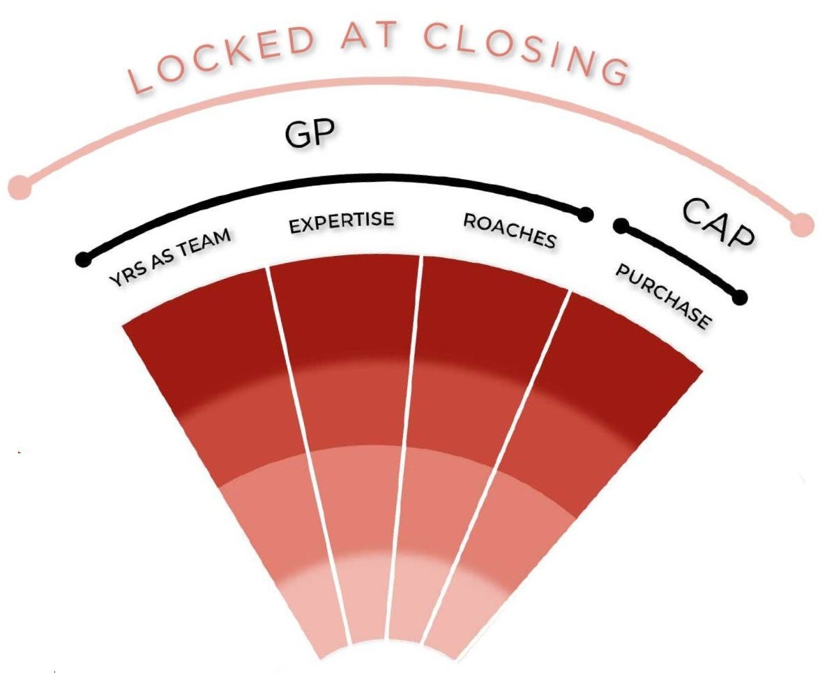
Locked at Closing
All metrics in this section are fixed at the time of acquisition, and do not change over time.
For better or worse, the GP and the purchase cap rate cannot be changed*.
*Yes, the GP can be removed for cause, but this is not a common or easy process, so I am ignoring that option here.
GP
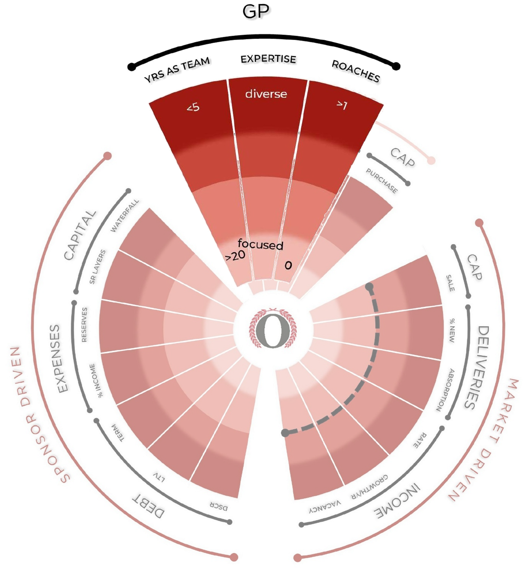
Years as a Team
The ability of the GP to maximize returns depends on the skill and experience of the senior leadership and their partners. A team with a long working history has navigated an array of operating conditions and is better positioned to succeed.
Why not consider years of experience by individuals? Projects are completed by a team, not a single person. The more experience the team has working together, the less risk there is for team failure.
Expertise
A GP who has mastered their trade is much more likely to succeed. That includes asset type, business plan, and geography. Diversification is good for investments, but not when sourcing an expert.
Roaches
A spotless record is the best indicator of a GP’s ability to reliably serve investors. Even one credible negative mark is reason to avoid a GP since - like cockroaches - if you see one there are likely hundreds more you don’t see.
Multifamily example: A team with more than 20 years of experience that has navigated a variety of market conditions and emerged with a sterling reputation is the best indicator of a team’s ability to serve LPs - no matter how difficult the conditions may be.
Cap Rate
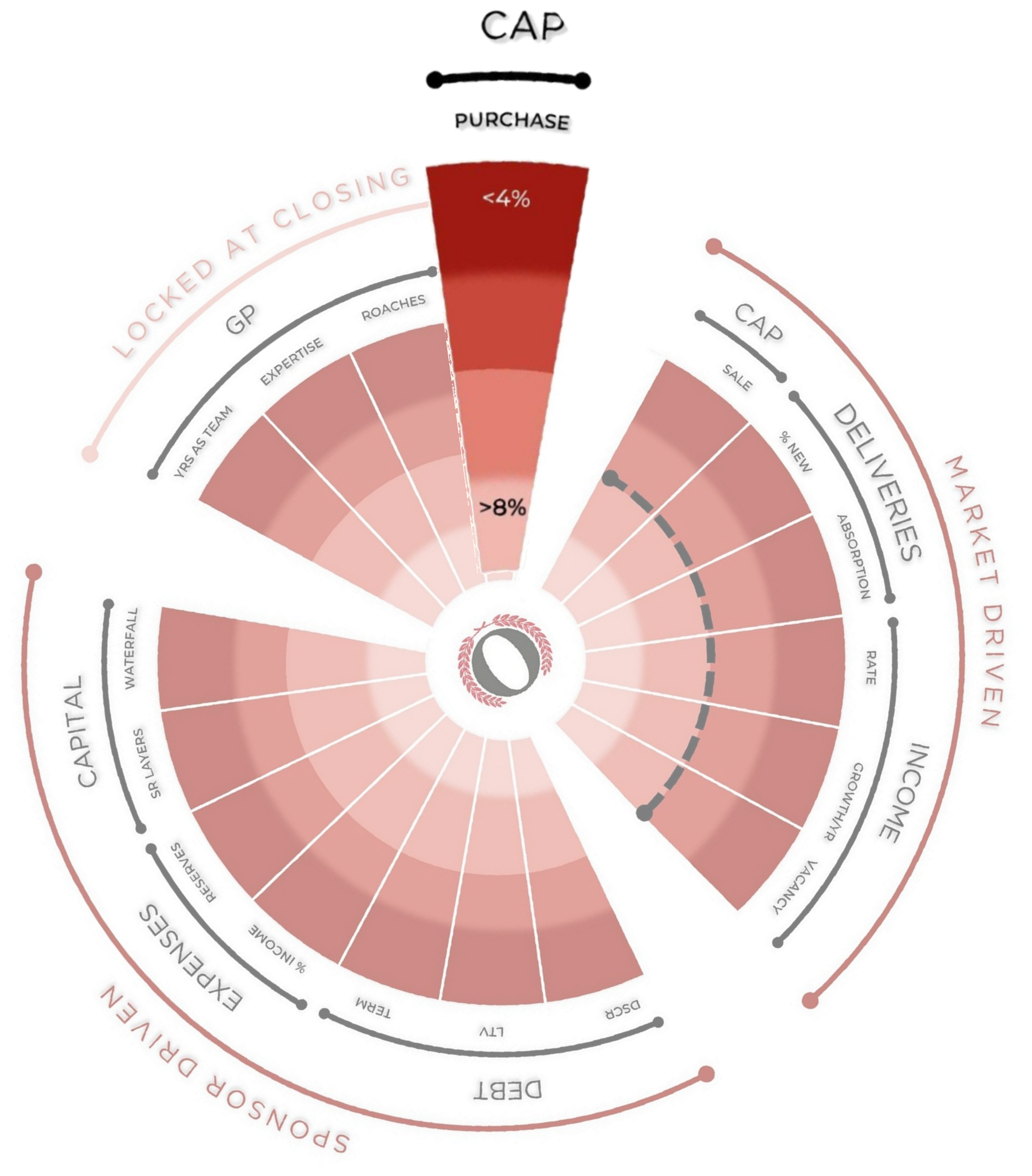
Purchase Cap Rate
Purchasing an asset at a premium or a discount will affect the profitability of the deal at disposition. A purchase made at a low cap rate is riskier since the market tends to revert to the mean (thus potentially losing value over time), and any profitability is solely dependent on increased NOI. Conversely, a purchase made at a high cap rate has market forces potentially lifting the underlying value regardless of NOI.
Multifamily example: NOI and cap rates rule the value of an asset. But cap rates are set by the market and cannot be controlled. No matter how much value is added to a property or how well NOI has been optimized, if a purchase is made at a low cap rate and a sale is forced at a larger cap rate, much if not all of that hard-earned equity can be lost.
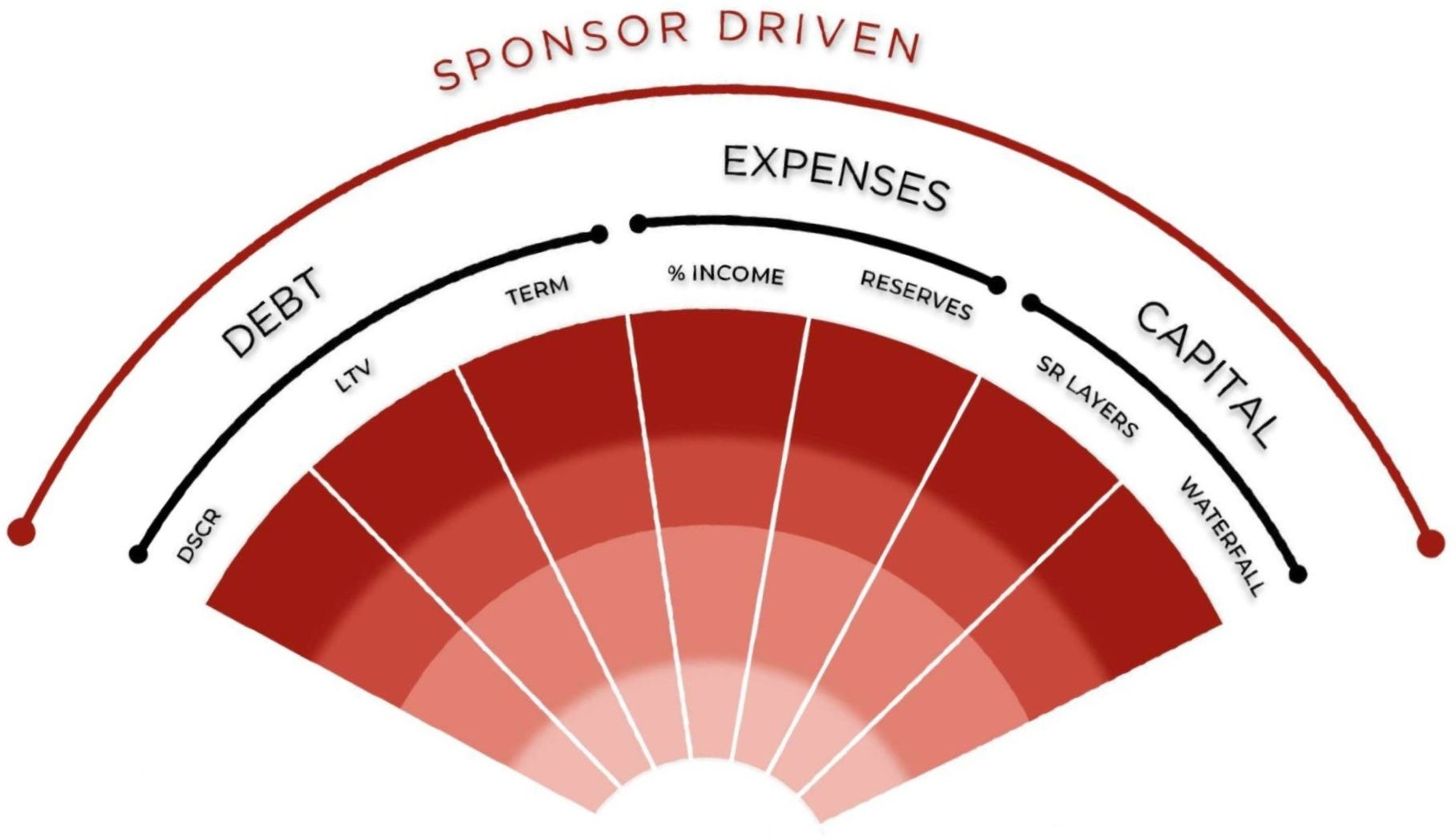
Sponsor Driven Metrics
This section covers the variables that can be driven by the GP, and can change (sometimes dramatically) over time.
All metrics in this section are subject to change due to market conditions, but how those conditions affect the deal is controlled by the GP.
The position at acquisition is not necessarily the position at disposition.
Debt
Term
Floating rate debt leaves one of the largest costs to chance, which is why it is noted on the outer/riskiest position. A fixed rate for at least the entire duration of the deal’s expected hold time is at the inner/least risky position.
DSCR (Debt Service Coverage Ratio)
A low DSCR leaves little margin for fluctuations in NOI while still covering debt in full. And, a lender can call a loan that is not meeting the DSCR threshold irrespective of the payments being current. Accordingly, the outer ring is for a lower/riskier DSCR and the inner ring is for a higher/less risky DSCR.
LTV (Loan-to-Value)
A high LTV can boost returns, but (like DSCR) can leave little margin for deviations in NOI. Plus, if market conditions depress an asset’s value (thus increasing the effective LTV), the loan can be called - whether or not it’s performing. It’s also important to understand what number is being used for “V”. A 70% LTV loan on the purchase price is not the same as 70% on the ARV (after-repair value), which is essentially financing a value that is not yet recognized - a very common scenario in value-add deals. The higher the LTV, the higher the risk.
Why the interest rate is NOT noted:
A deal can be profitable at any interest rate. It’s the increase in the rate that can kill a deal.
Multifamily example: If any single lesson can be learned from 2023 it is that debt cuts both ways. Leverage boosts return projections, but a floating rate that triples can kill an otherwise good deal - either by the debt payments ballooning to an unaffordable number, or by the debt burden exceeding the DSCR or LTV requirements - in which case the lender may require refinancing or reduction of the principal to bring the loan back within the lender requirements. This is the source of many a capital call and the loss of numerous multifamily deals.
Expenses
Expenses as a Percentage of Gross Income
No matter how efficiently managed, assuming expenses below industry averages can be achieved - and maintained - is unrealistic. Regulatory changes and natural disasters can increase expenses quickly. Changes to property tax incentives and tariffs are recent examples of unforeseeable changes that increased costs with no possibility of mitigation.
Reserves
The best defense against unexpected costs of any type is reserves. Deals with little margin for error and thin reserves have been forced to issue capital calls or source rescue capital to bridge cash flow gaps.
Multifamily example: Expenses, like rent lift, are frequently toyed with in pro formas to increase NOI. However, no matter how effective the operator, the reality of expenses will always come to light.
Capital
Senior (Sr) Layers
The further back in line a position sits to be paid, the greater the risk that returns never reach it. An investment with zero layers above it (such as senior debt) is the lowest risk, whereas common equity can stand behind many senior layers such as mezzanine debt, pref equity, and different classes of common equity.
Waterfall
The waterfall agreement is where LP and GP interest alignment is determined, and dictates how and when investors receive returns on and of their invested capital. The flow of cash will always influence behavior. The more a GP is rewarded in advance of the LPs, the greater the risk of undesirable behavior.
Multifamily example: Ideally, the waterfall agreement will incent the GP to act in the LPs’ best interest, and the GP will manage the capital stack with respect for the original investors’ interests. However, this isn’t always the case.
For example, a GP may choose to issue pref equity rather than make a capital call, leaving the original common equity investors last in an ever-lengthening queue of payment obligations. In this scenario, the deal may exit successfully but common equity returns may be severely depressed or lost.
The subscription documents detail the position in the capital stack of each investment class, and how it can be changed by the GP.
The capital stack can change over time, and dramatically alter the LPs’ risk position.
When common equity is a total loss due to a poor waterfall agreement and a changed capital stack: The Debrief: Ripley
Market Driven Metrics
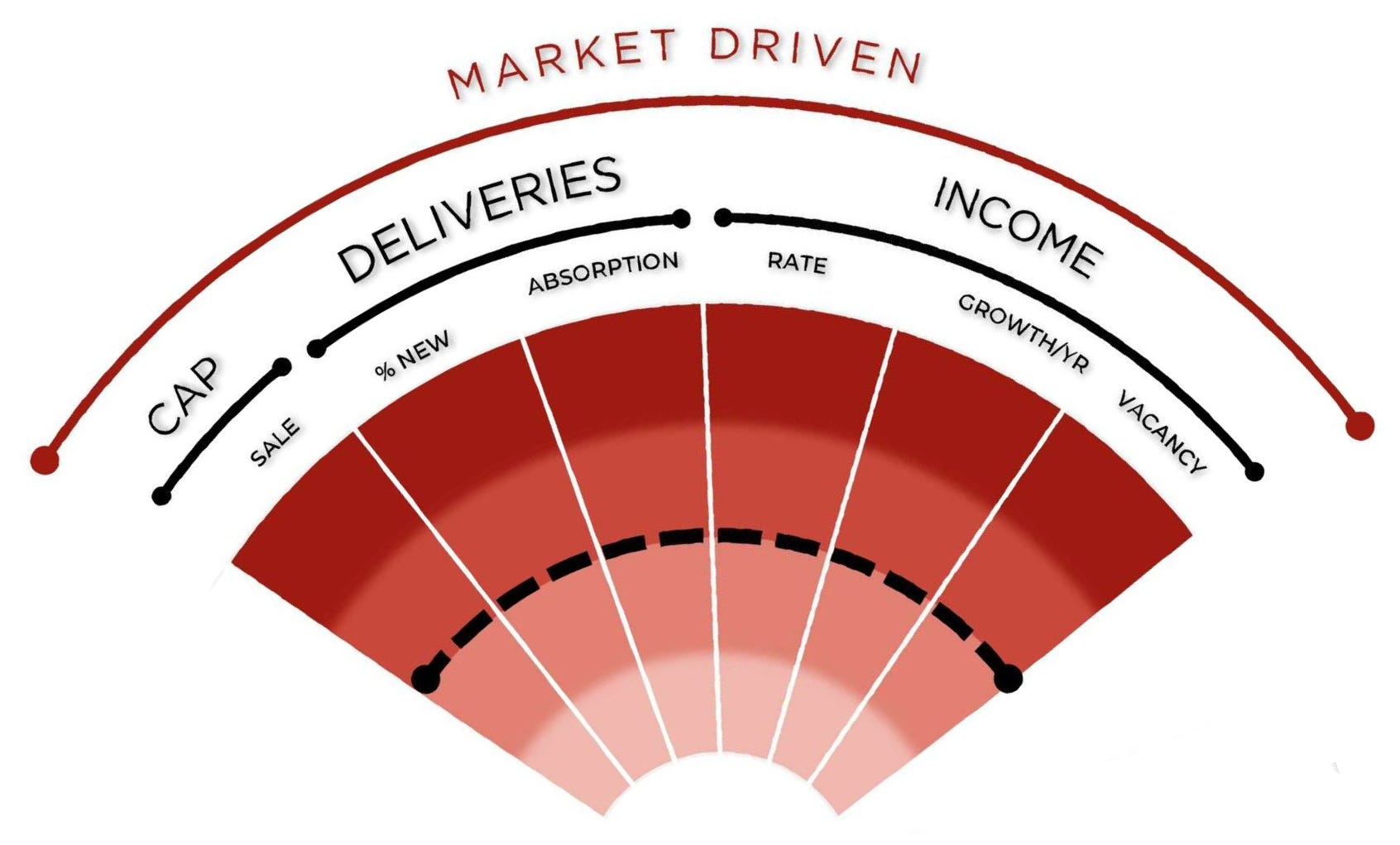
This section is dedicated to metrics that change with market forces and revert to the mean over time. The long-term average is indicated by the dotted black line.
No data point will remain at the outer limit indefinitely.
The mean is always the center of gravity.
Cap Rate
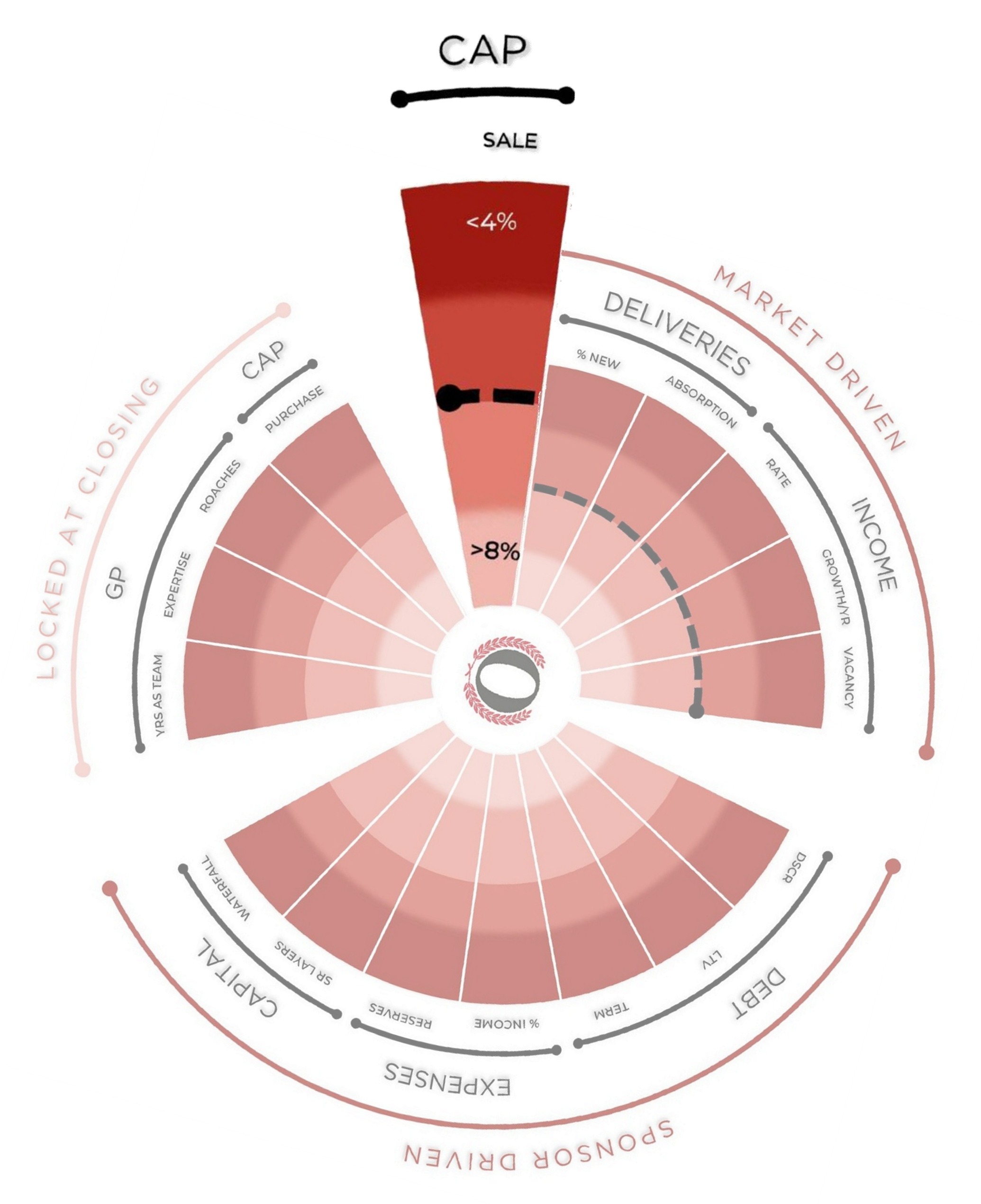
Assumed cap rate at disposition/sale
Cap rates are highly sensitive to market changes. Assuming a hot market that trades at low cap rates will persist is not realistic, and is the demise of many a deal.
Multifamily example: The image below shows the historical low cap rate of under 4% at the outer edge and the historical high of over 8% at the inner edge, with the average near 6%. A pro forma that assumes a low exit cap - plotting toward the outer edge - is risky: the market tends to revert to a higher cap rate, potentially cutting the asset's value below plan. A pro forma that assumes a high exit cap - plotting toward the center - is conservative: reversion would compress the cap and lift value.
Deliveries
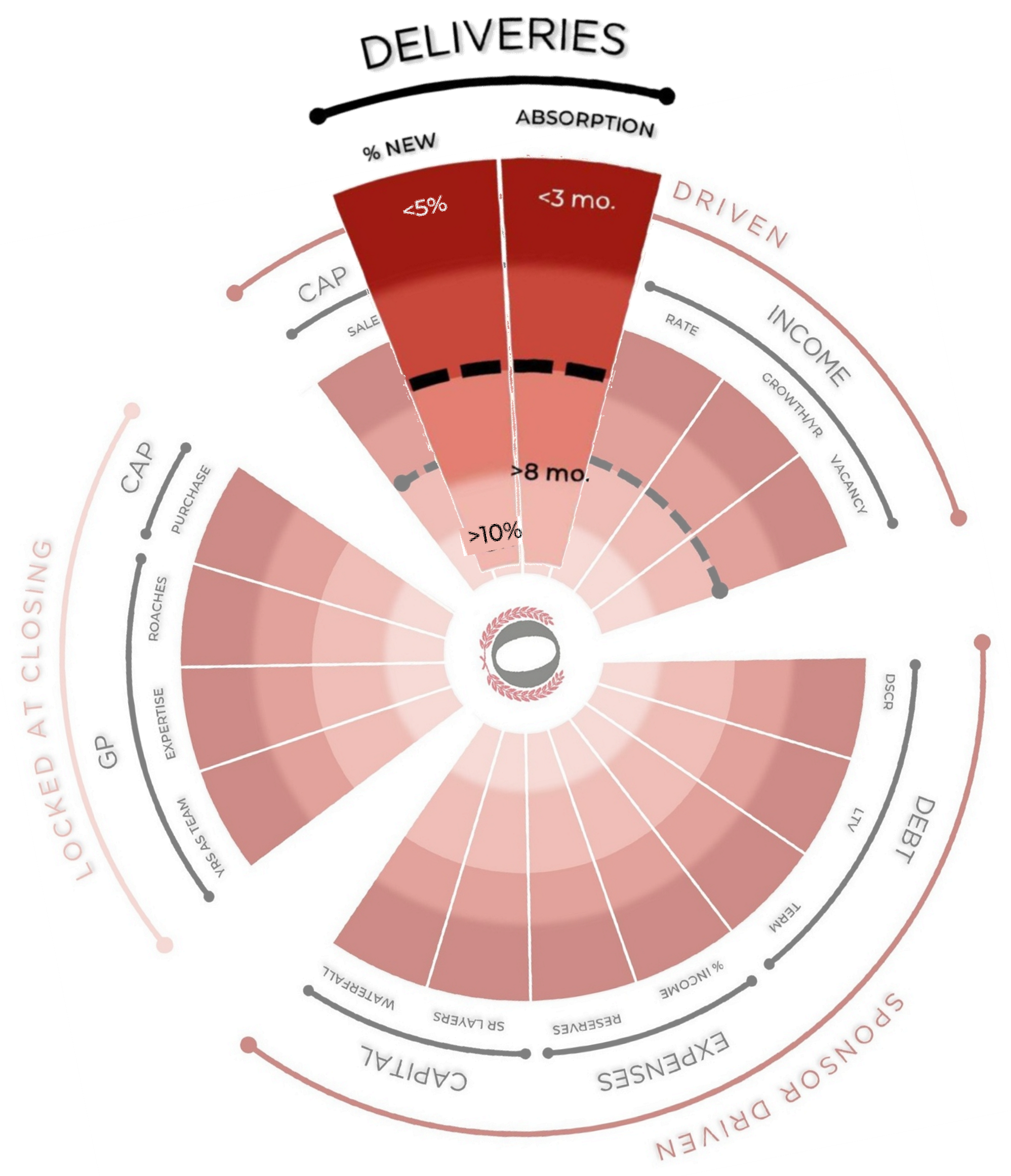
Delivery of new inventory is one of the most easily sourced yet overlooked data points. Simple supply and demand economics have dramatic effects on NOI. If a pro forma is modeling a market with demand outpacing supply indefinitely, there is little evidence to believe this is possible. The following two metrics account for future supply and demand risk.
% New (New Deliveries as a Percentage of Existing Inventory)
The anticipated number of deliveries as a percentage of the existing inventory easily demonstrates how supply dynamics will shift over time.
Absorption Rate
Absorption rate measures demand. A low figure means demand is outrunning supply; a high figure means the reverse. Because the radar plots the assumed future absorption rate (not the rate at the time of acquisition), assuming a tight, fast-absorbing market will persist is the riskier position - the efficiency of markets dictates that supply will arrive to meet demand, and possibly exceed it.
Multifamily example: It may appear counterintuitive that low deliveries and quick absorption rates are the highest-risk position, but we are looking at assumptions for future (not current) market conditions. If the market currently has few deliveries (low supply) and a fast absorption rate (high demand), we must assume that future supply will arrive to meet demand and that the market will equalize. Assuming otherwise is typically unrealistic, and is thus the riskiest assumption.
Income
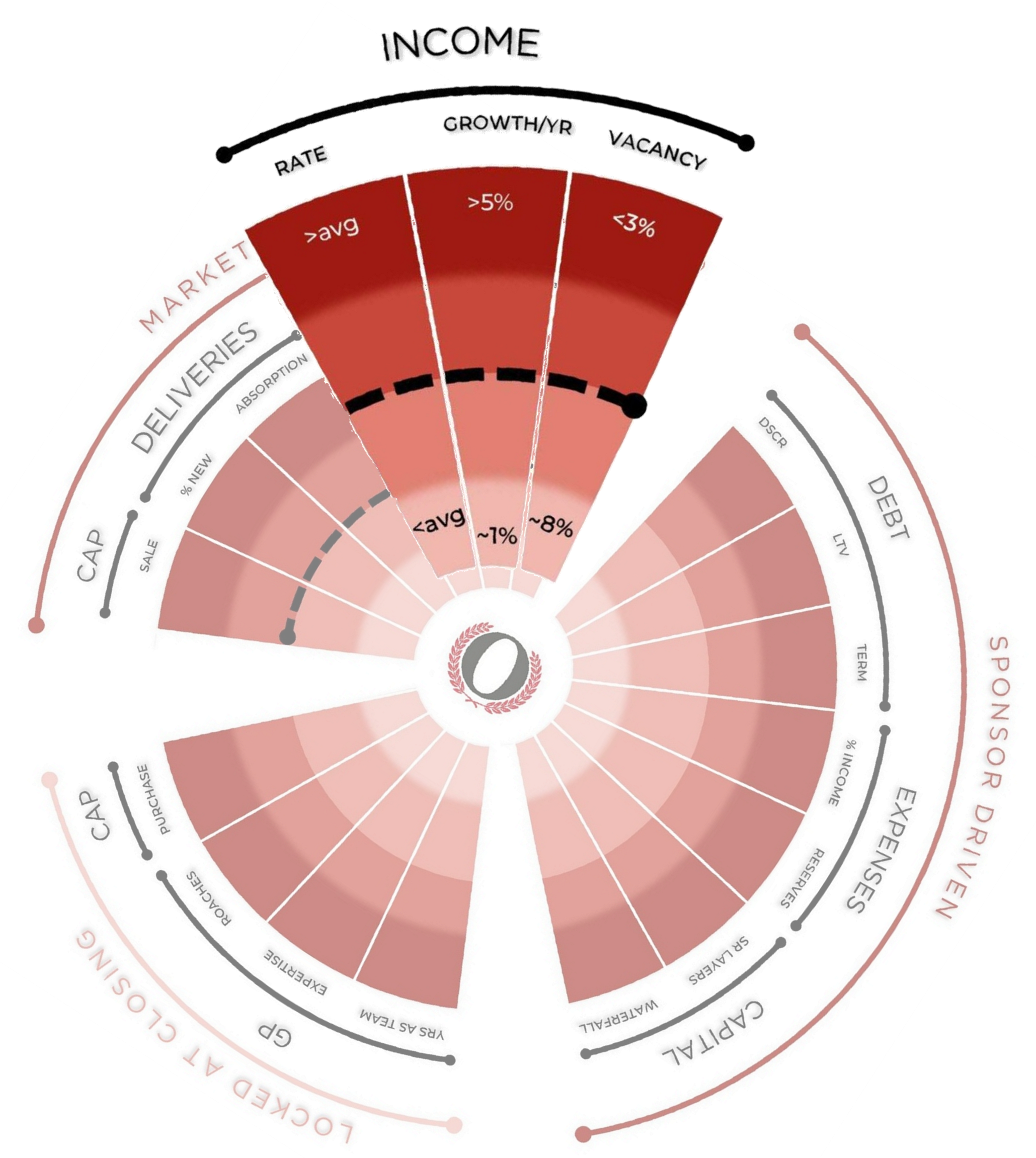
The income assumptions plotted here account for market risk - not cash flow risk. A value-add or development deal must pass through periods of investment before recognizing income. Scrutinizing the business plan for cash flow management in relation to market assumptions can illuminate gaps in the business plan.
Rate
The income rate is determined according to asset class and market norms such as price per square foot (residential and commercial) or RevPAR (hospitality).
Multifamily example: Above-average rental rates, high year-over-year rental rate growth, and low vacancy rates are favorable market conditions, but assuming these conditions will exist over long periods of time is not realistic and can present an assumption with a high potential for failure.
Deals seldom fail for unforeseeable reasons - they fail at the spokes with metrics at the outer edge.
Next Time
The Debrief will plot every retrospective on the Risk Radar to test whether the stress points that surfaced in reality were visible in the offering materials.
I will also plot the Fantasy Acres project from the Heuristics pro forma series to show that 2021/22-vintage deals struggling today are no surprise, but a foreseeable market norm.
Concluding the series, I will provide a step-by-step guide to using AI to source and apply deal-specific data to the Risk Radar for tailored analysis.
Try it Yourself
Plot a deal on the Risk Radar and judge the risk profile for yourself. And if there’s a breaking point that the radar doesn’t account for, tell me where it’s wrong.
This post and the Risk Radar framework are for educational and informational purposes only. They are not investment, legal, tax, or financial advice, and nothing here is a recommendation to buy, sell, or hold any security or to invest in any particular deal or sponsor. I am an individual investor sharing my own framework and opinions - not your advisor or fiduciary - and reading this creates no such relationship.
Risk Radar is a visual heuristic, not a scoring system, a rating, or a forecast. It compares a deal’s stated assumptions against broad historical averages and industry norms; it does not measure or predict any deal’s actual result. A profile that plots toward the center is not “safe,” and one that plots toward the edge is not doomed - the tool is a starting point for analysis, not a substitute for it. Historical norms describe past tendencies, not guarantees, and markets can behave differently than they have before. Any deals referenced are illustrative and anonymized.
Always do your own due diligence and consult your own licensed legal, tax, and investment professionals before making any investment decision.